Design Process
Design Process covers the whole iterative stages from researching to production.
Research
The main purpose of researching is to get the knowledge of Stadia and State Share and figure out several possible usage situations.
As Stadia just came out a few months ago and the team are still working to realize State Share feature, we started off mainly by searching the internet for the documentation and demo videos of State Share. There are a few resources we found very useful: the first is Stadia development blog and State Share explanation where we can have an overview of what Stadia is, how State Share works and several possible usages of that function.
Ideation
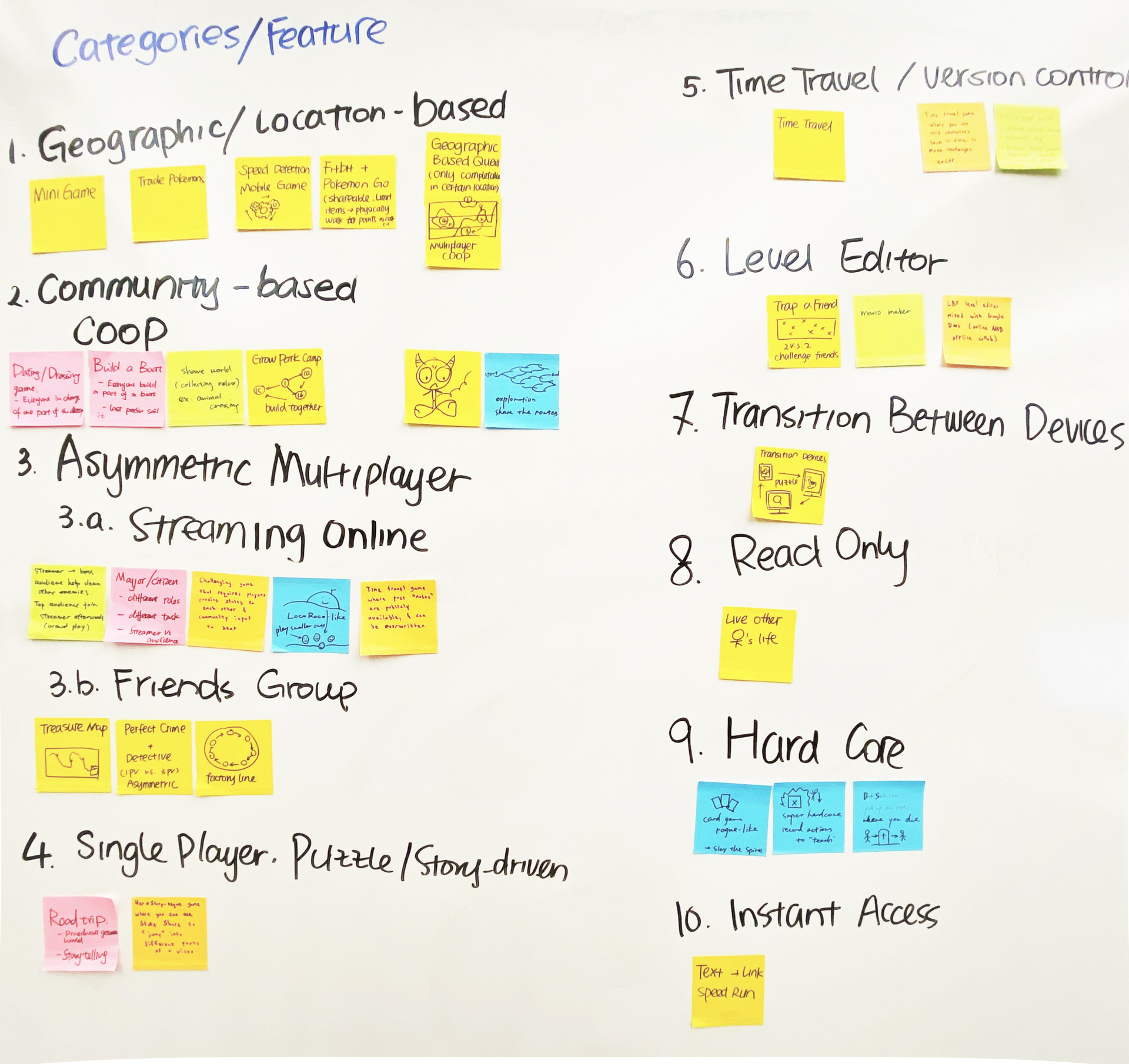
During the ideation phase we specified the genre that could potentially fit the situations mentioned in our research. Our approach was to think of ideas at a higher level that use State Share as a main mechanism. There were 10 scenes that we think could be possible for implementing State Share.
We went through each scene on its feasibility, novelty and how close is State Share related to the theme. And we choose five categories to move on to the theming stage where we wanted to come up with more specific gameplay that uses the feature. By the end of Week 2 we got the following: geographic/location-based, community-based coop, asymmetric multiplayer, time travel/version control, transition between devices.
As part of our plan and client’s suggestion, We planned to create a one-page design document for each and try making paper prototypes. 
Prototyping Phase 1
After narrowing down ideas, we began making paper prototypes and doing playtest both internally and with naive guests. This iteration phase is helpful to solidify our ideas.
We make one page design document for each idea to better illustrate the conception to the audience, especially for those who are not familiar with Stadia. We eventually built 4 paper prototypes as following:
- Sharing Information (Photo Leap, Escape from Timelock Manor): like most multiplayer games, the game synchronizes data and passes the end of last state to the next player.
- Geographic/location-based Multiplayer (Animal Inn): We think of ways to connect players around the world to play together using State Share. Animal Inn is an idea where people raise pets and “send” them to others for a short time.
- State Tagging (Bomb Express): To let players pass a game back and forth by delivering the state to the next player after a time period. Our idea was to make a game where player pass ticking bombs like a hot potato.
- Go Viral (Virus vs Cell): The idea was mainly letting as many people as possible join a battle between viruses and cells, preferably with their favorite streamers, in a virtual mass battle.
In this stage we mainly focused on finding interesting mechanics where the State Share feature is suitable to be implemented. Also per our client’s suggestion, we created one-page design documentation for each to depict the overall mechanics and game flow.
The shortcomings of almost all of our ideas at this stage was that they are not fully highlighting the feature of State Share: to record the full progress and transfer a bunch of information. We also face the problems regarding replayability, theming, and privacy problems.
During this stage we also got a lot of valuable feedback from our client, faculty instructors and playtesters. Here is the three criteria that we figured as the key to a (potentially) successful State Share game:
- Asymmetrical gameplay is suitable for streamer and audience as it well conveys State Share’s core idea.
- Having a persistent world (like MMO games do) is state sharable and could let players feel more immersed.
- To make multiplicative distribution rather than transferring a single branch to new players. UGC game requires more system design to control the game, and platformers really need decent levels.
Prototyping Phase 2
After we narrowed down ideas into two big categories, we began to make the prototypes in higher fidelity to help confirm the idea. During this phase we made a digital prototype and a paper prototype.
Prototype 1: Virus vs. Cell
We all agree to make a digital prototype for the Virus vs. Cell idea for the following reasons:
- Some ideas are hard to paper prototype, even for those paper prototype-able ones it does not wholly match the feeling we want.
- Digital prototypes offer insights into controlling and feedback which paper prototype cannot give.
- As the project progresses, we need to settle down on art style and hardware as our final deliverable will be a digital game, so it is good to start early exploring possible approaches for the ideas.
In this prototype we are testing many aspects of the game, more specifically:
- For designers, to confirm that the level and gameplay works well together and implements State Share as one of the core mechanism.
- For engineers, to test technical solutions for State Share (at least faking it) such as separate control for individual player, split screen, and the fundamental splint and merge function.
- For artists, to try different ways of simulating responsive, interesting graphics to make the world feel real.

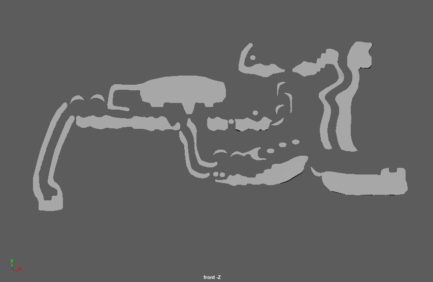
Map that we prepare for the playtest before halves.
In this early version we are building the first part of the idea: the virus camp collect power-ups and prepare for the fight with cells. The player can explore different levels and try getting collectibles many as possible by jumping in this 1-minute experience.
Prototype 2: Treehouse
On the other side, we wanted to make a paper prototype for the second idea for the following reasons:
- We only had less than 2 weeks on our schedule before halves, and we wanted the project to be on a good balance without leaving any of two prototypes behind.
- The treehouse idea is feasible for paper prototyping as its core gameplay is pretty clear and understandable even on paper.
- We don’t need to test out every detail. Instead we focus on the “share” part and everything we do for paper prototype can be transferred easily to Unity.
We came up with the theme of growing a treehouse: there is one immortal elder in charge of the whole ecosystem, and they invite elves (also workers) to play the game for a limited time. They work together to collect resource underground, branch the tree, and build houses and facilities. When an elf dies, they can pass their data to another player but also keep their work remaining in the world.
The game also has a weather system which adds factors that affect the resources and have random events.
Pivoting after Halves
Everything’s changed a lot as we did our half presentation and embraced the mid-semester break during which we realized we had to work remotely in light of the situation. Our client, Erin, in the very first virtual meeting acknowledged our work so far and suggested that we continued to polish our game and make a short clip about it demonstrating the core features and mechanics.
With her advice, we partly pivoted our foci for the project:
- Instead of making a competitive game, to make a PVE rich level highlighting the State Share feature.
- Try making a pitch for the game on Stadia platform.
Still, we want a polished prototype that can be showcased to the ETC faculty.
Final Prototype
Starting week 11 we officially started the agile development process for the final prototype. We set sprint goals for each week and keep doing daily scrum standups (virtually) to make sure everyone is at the same pace and doing things as expected.
During discussions with our client, we had set a list of priority for things we wanted to do. Thus We first sat down together to determine the overall scenario for the new game scene starting from the most important mechanics, userflow and aesthetics, as done by the whole team discussing collectively and with the client. The designer and programmer talk about the detail in levels and determine the priority of implementing new mechanics, art assets and other things.

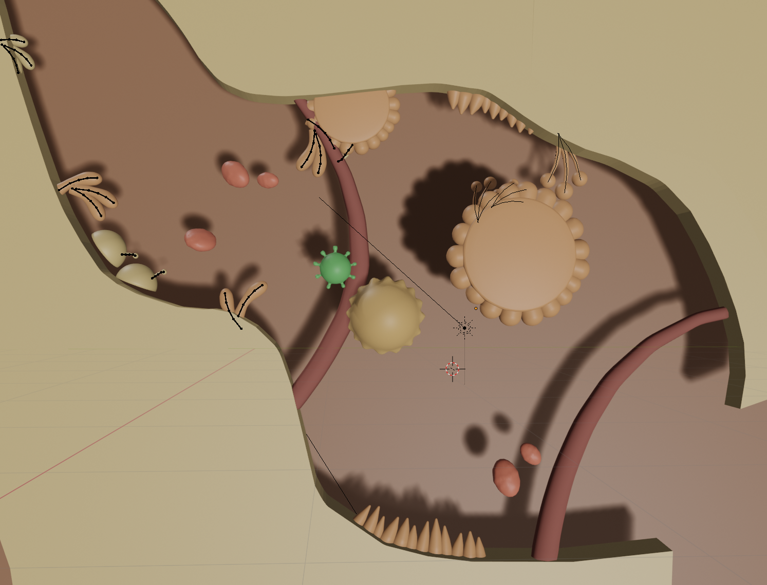
A screenshot in Blender showing the concept art for map decorations.
From the aesthetic side we also began researching the approaches of representing the “cute evil” theme.
The game design change mainly involves:
- With attracting non-stadia audience in mind, to make the level easier to understand and simplify the control. Additionally, the game will not have built-in gravity anymore.
- The game shall highlight the interaction between players because they now can see each other in the game. This brings changes to the level layout and boss design.
- The game now is based on PvE content, thus we had more freedom in creating different types of cells and enemies and more interesting mechanics. This also changed our level design because we don’t need to balance the two sides.

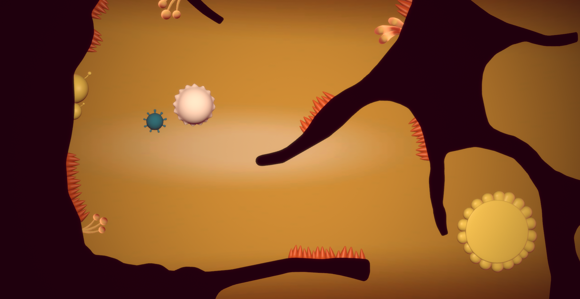
A screenshot in Unity with the level in progress in week 12.
In week 12 we mainly focused on the overall visual style and the name issue. We created the logo graphics for the title, Immunoo, which deprives from immunity but sounds cuter.
Meanwhile, the UX designer continues to refine the userflow of sharing the state and make new storyboards of attracting players to join the game and the onboarding process.
By the end of week 13 we had settled on the most important mechanics in our game: replication, inheritance, more cells more power, and environmental effects. We in week 14 collectively confirmed specific skills we want the players to have in current game and future downloadable contents.
Week 15 was the last week we actually had to further the development. We implemented magnetism skill in game and refined level layout to better fit what the client suggested, “Introduce Practice Master” model, essentially having an increasing demand for player’s skills in levels.